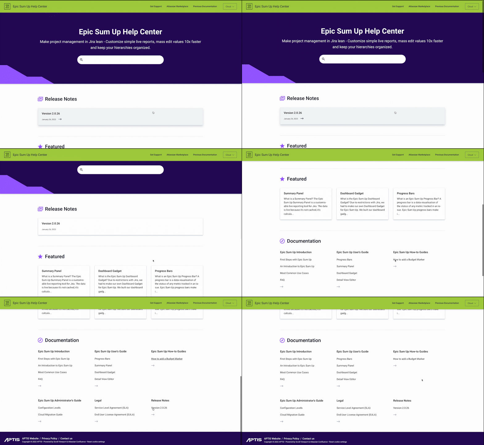
When the APTIS team decided to redo the documentation for their flagship app, Epic Sum Up, their primary objective was to get rid of an unnecessarily complicated structure. After all, your products may be complex but to serve your customers well you should ensure that your documentation is as simple as possible.
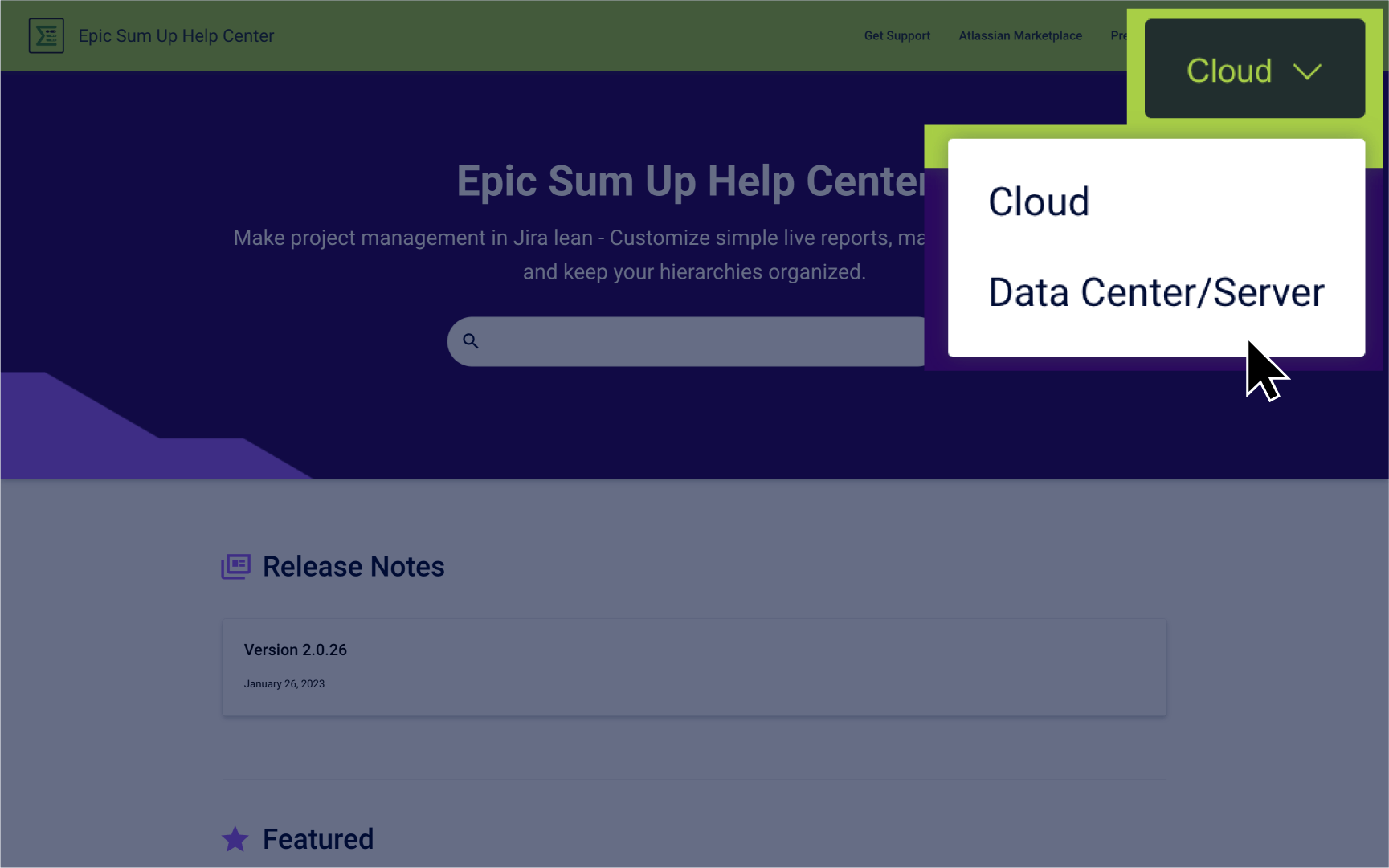
With over 2K installs, Epic Sum Up is one of the most popular lean project management apps for Jira on the Atlassian Marketplace. The app is available on Cloud, Server, and Data Center, and managing documentation for all three app versions separately was becoming difficult over time. The app has several feature differences, depending on the hosting type, and the team was looking for a tool that could simplify documentation for all three versions while making it easy for customers to navigate to the right app version.
They found what they were looking for with Scroll Viewport for Confluence.
About APTIS
Founded in 2014, APTIS is a German Atlassian Marketplace Partner with extensive experience in building apps for Jira and Confluence. Their flagship app, Epic Sum Up, is one of the leading apps on the Atlassian Marketplace. Epic Sum Up enables its users to keep their project management in Jira lean through customized live reports with progress bars, more organized hierarchies, and faster mass editing.
What Prompted the Move to Scroll Viewport for Confluence
As APTIS’ flagship app with a significant number of customers, Epic Sum Up is also the app that requires the most documentation. The decision to redo their documentation had been around for a long time because the team was unhappy with its complicated structure.
One of their biggest challenges was having to maintain three separate spaces for the Data Center, Server, and Cloud versions of the app. This was not ideal because, in addition to maintaining each space separately, the team also had to manage versions within these spaces, making it even more complex.
Johanna Pichotka handles marketing and customer experience at APTIS and was in charge of finding a new tool that made it easy to handle these complexities.
She says, “The part about handling versions between and within apps was definitely our biggest challenge. For example, the way we added versions was to have a page with paragraphs carrying multiple versions titled Version 3.7, Version 3.6, etc. and the paragraph on top would be the newest version. Understandably, this wasn’t a great experience for a customer either.”
One of the things that influenced Johanna while researching for a new tool was looking at what other marketplace partners were doing – how they handled documentation, which help center sites were easy to navigate, and which ones looked appealing.
Why Scroll Viewport for Confluence Checked All The Boxes
According to the Epic Sum Up team, what really stood out was seeing how we at K15t use Scroll Viewport for our own product documentation across apps.
What they really liked about K15t’s documentation was:
-
The simplicity with which multiple versions and variants are handled.
-
The ease with which you can switch between versions and variants.
-
The hassle-free navigation of the help center.
They realized that this overall ease and simplicity would go a long way not just in creating content but also in updating and maintaining the documentation over time.
A noticeable drawback of the old help center was how often Cloud customers would land up in the Server documentation space and vice versa because of the multiple spaces and pages. As a result, there would be quite a lot of confusion, and unnecessary support tickets were raised that could have been easily handled if the customer could navigate to the right documentation based on their hosting type.
But moving to Scroll Viewport for Confluence solved these concerns and more for Epic Sum Up and its customers.
Designing a beautiful looking help center
What stood out the most for them was how easy it was to make the help center look beautiful with minimal effort. Especially for a small team with minimal design skills, just using the available templates and layout editor is enough to present information beautifully.

Seamless integration with other Scroll Apps for Confluence
The easy integration with Scroll Documents for Confluence is what elevated the help center experience even further because customers could now directly land in the right version or variant of the product they were using and find answers to their questions. The content creation process itself was also a lot easier with Scroll Viewport for Confluence.
It was powerful to see how using labels or conditional content macros on a page would add multiple variants and saved them from the hassle of creating pages over and over again every time there was an update. This made it easy to handle complexity without the added stress.

Easy to collaborate on documentation
The APTIS team uses Confluence as their internal wiki and the content creation process is collaborative to a large extent. While most of it is handled by the support team, other teams like marketing need to constantly be in the loop. They have a proactive approach towards documentation and prefer to use their help center not just as a place where customers can find answers to specific questions but also offer guidance on how to use the product more effectively. This was the part that was missing in their customer education strategy and moving to Scroll Viewport for Confluence solved this for them as well.
We’re committed to helping you to create beautiful help centers that are easy to manage and enable your customers to derive the maximum value from your products. As a fellow marketplace partner, it’s extra special to see how Scroll Viewport for Confluence has simplified documentation for Epic Sum Up and the APTIS team.
Try It Free
Looking for a simple way to publish your product docs like APTIS? Try Scroll Viewport free for 30 days on the Atlassian Marketplace.