How User Insights Can Improve Your Help Documentation
Creating and presenting a beautiful help center is easy with Scroll Viewport for Confluence Cloud and a great first step towards making your help documentation readily available and accessible to your users.
However, along the way and especially when putting together the content, too often teams forget who they are writing for. The result: users who struggle to find their way to the information they need, stumbling over jargon-filled help articles and finding that none of their keywords return any search results.
It doesn’t have to be that way. Leveraging the knowledge your team has about your users and their needs can transform your dry product documentation into a powerful and intuitive collection of help topics.
Learn how we in the Scroll Viewport team put our own tool and user insights to the test to bring a more user-informed perspective to our own help center.
Put Your User Insights to (Good) Use
Whether it’s user researchers, customer success representatives, support agents or customer advocates: in and around your team you are surrounded by real user and customer experience experts. They know about users' goals but also about their current pain points when using your product.
Your customer experts know that the help journey does not start or end with reading help documentation. Placing a help topic where it’s needed and useful has a lot to do with working out a good documentation structure but it's also about taking these bits of content and placing them all over relevant customer touchpoints.
Scroll Viewport for Confluence Cloud supports you at all steps of the process: It delivers the content you have in Confluence directly to your users as a beautiful, customized online help center. Always available, always up to date.
Using your favorite Confluence macros, edit and style your articles to convey meaning and structure for each topic in a clear way. With Scroll Viewport, it's easy to guide users' journey from topic to topic in a meaningful way.
For example, within the articles, Confluence macros like the info panel help us highlight common pitfalls and troubleshoot the issues we know our users tend to run into:
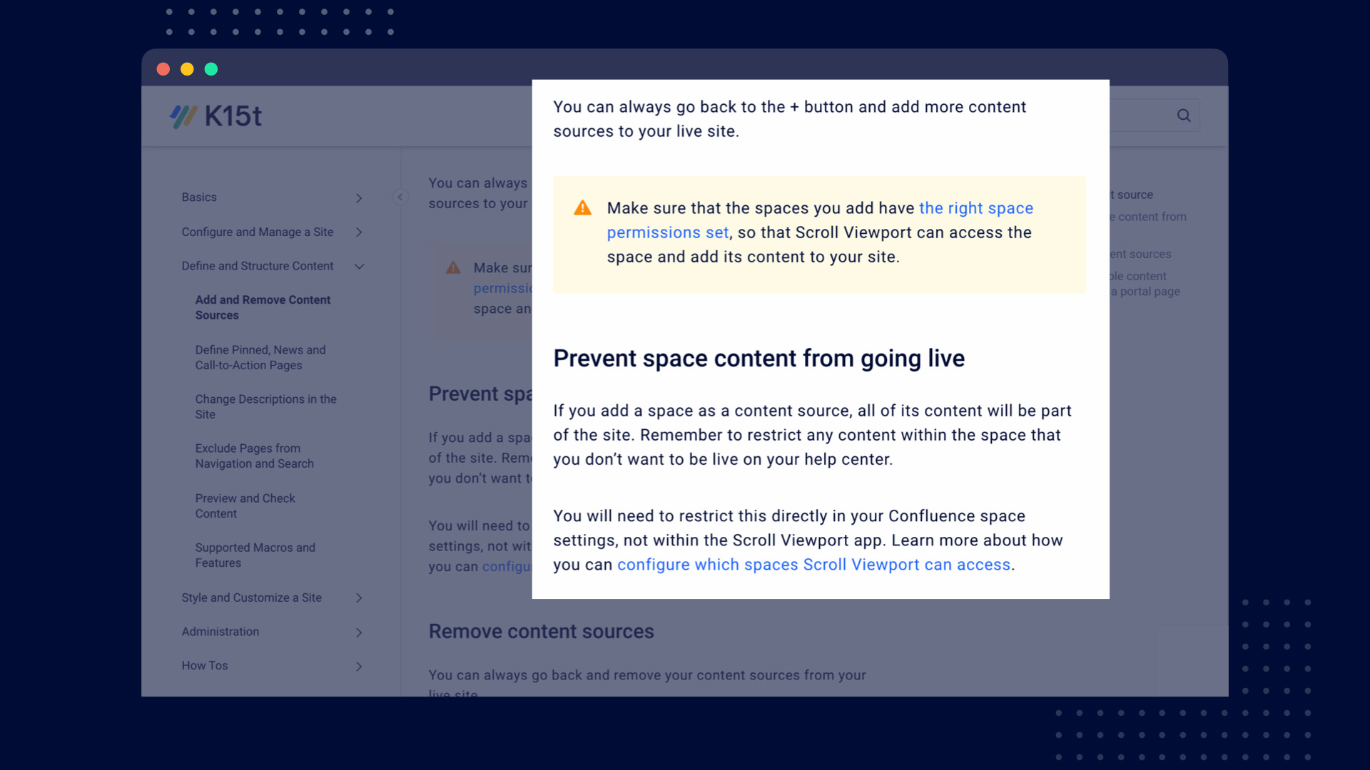
Pinning articles on the landing page is a great way to draw attention to the topics that you know are most relevant to your users. Not sure which are worth pinning? Again, your customer experts might know the answer. Do they also want to highlight the content inside your product? No problem. Just embed your help center content as in-app help, no re-writing needed.
For our own Scroll Viewport documentation, we know that users care about the app’s styling options, so it makes sense for us to highlight the content that educates users on how they can properly customize the theme:
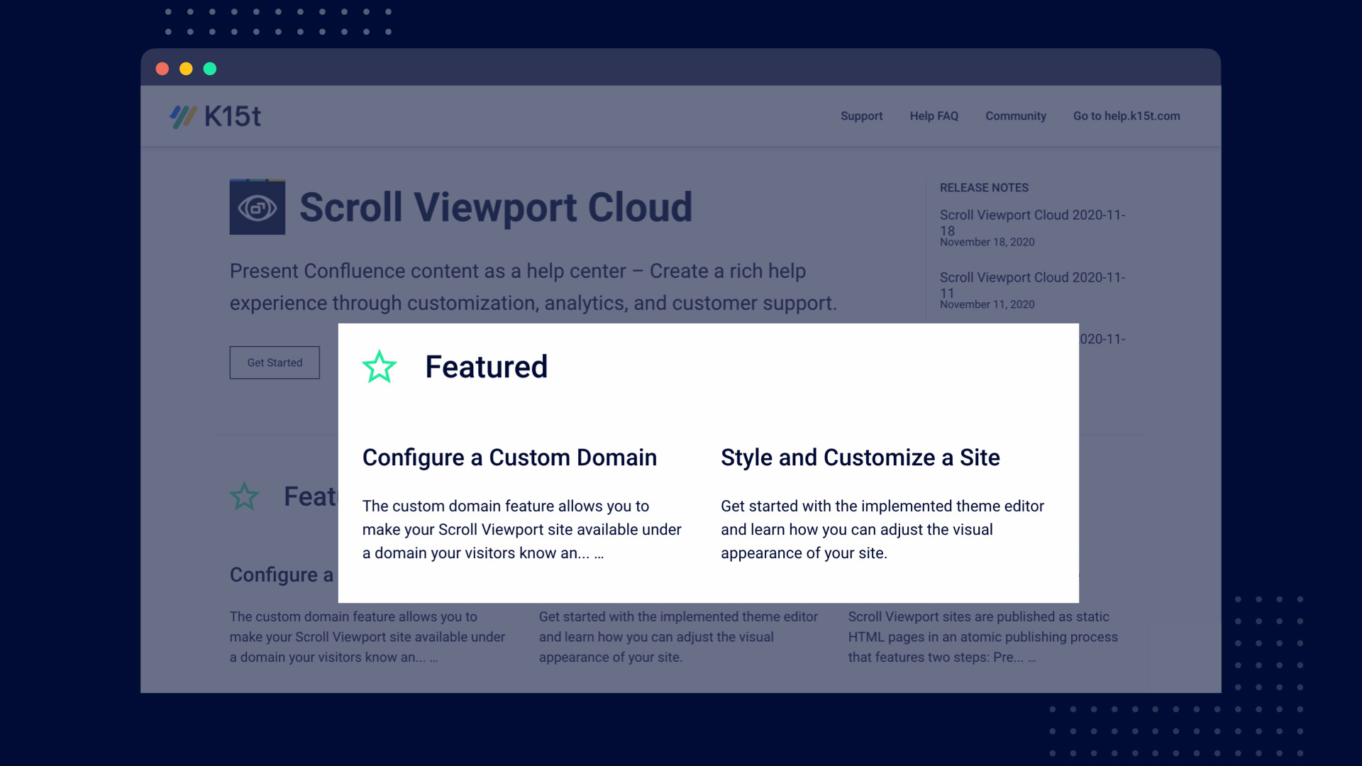
Remember: Your Users Don't Have Your Insider Perspective
When we in the Scroll Viewport team took a critical look at our own help center, we found that in order to navigate the content, users required a fair share of product knowledge.
As a Scroll Viewport user, if you didn’t know that integrations like the support desk widget were configured inside the app’s theme editor, you would probably not look for help within the section Configure the Theme. From a user perspective, the topic made more sense in the context of Configure and Manage a Site.
We also realized that many of the underlying technical concepts that we explained had little regard for what users wanted to achieve with the app. Outlining a schema of our updating and publishing process was informative but didn't tell our users anything about how they needed to update or publish.
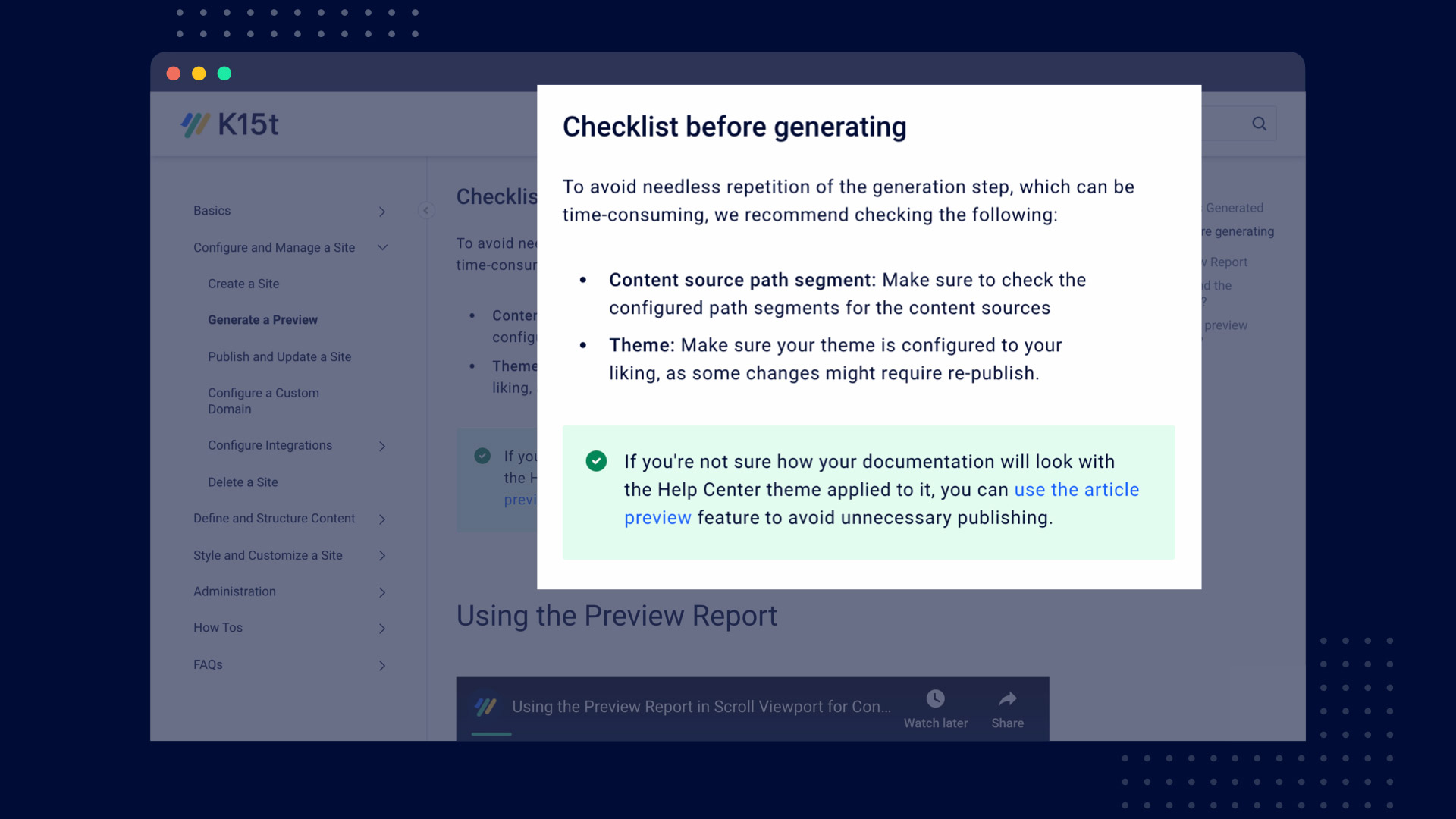
It was when we combined the existing technical information with a checklist before generating, that the content was suddenly transformed into actionable product knowledge for users.
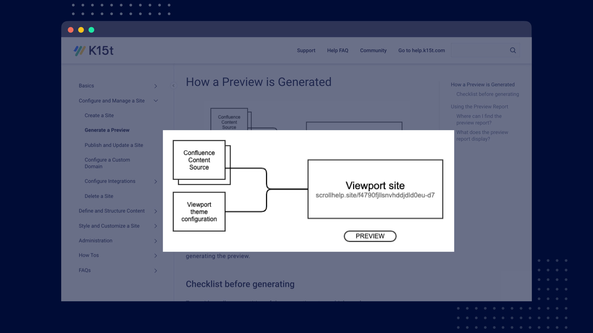
Above is an example of valuable but non-actionable information for the users, compared to the actionable checklist example below:
Let Your Content Follow User Tasks, Not Navigation Paths
Structuring a product into components or modules makes a lot of sense in product development and management. However, shoved in front of users who are looking for guidance that same mental model will do more harm than good, and put an abrupt end to users' self-help journey.
Users who need your help have very specific tasks and goals in mind. As we have seen, if the documentation mirrors how teams think, plan, organize and work internally, chances are that users will get lost.
For us, we knew how important it was for users to configure the Help Center theme in a way that made it feel and look on brand for their company. However, our product documentation wasn't really helping them complete the task with ease.
For example, finding the article Configure the Theme was straightforward enough. However, if users simply wanted to find out how they could add their company logo to the header of their Viewport site, they needed to know that this option was part of the Help Center theme, click to open, review a full list of Theme Templates, and navigate all the way to Global Templates. How could they know?
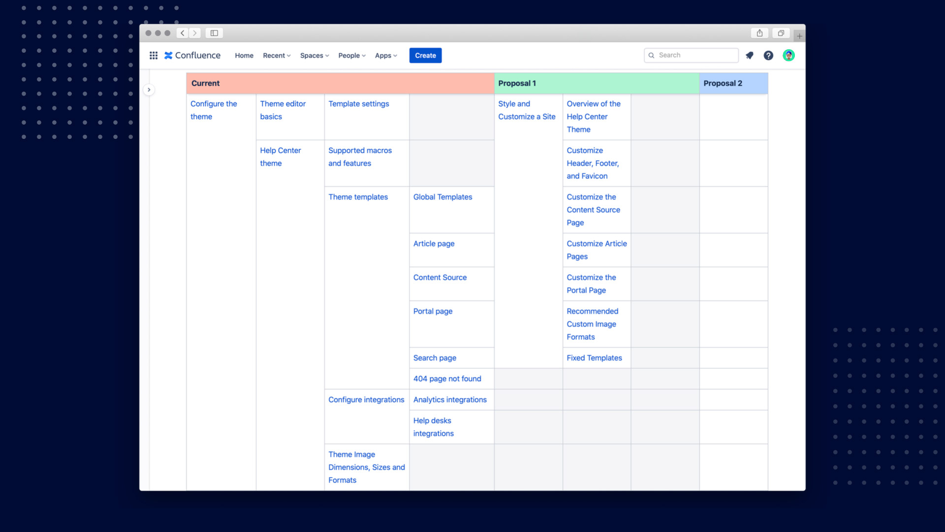
They couldn’t. Following what we knew about users' use of the app, we decided to clean up the convoluted structure and started changing the article headings. The article Global templates simply became Customize Header, Footer and Favicon.
If you work in a larger team or are planning to completely re-structure your documentation, like we did, you should put some thought into how you want to make the changes. Create an inventory list of your content using the Child Page macro, and with the help of tables iterate on the structure until everyone in the team is happy. Here's an example of our inventory:
Start Incorporating User Insights into Your Docs
Ready to bring a more user-informed perspective into your help content? With Confluence Cloud it's easy to manage your documentation and keep up with continuous changes. Add Scroll Viewport to the mix, and see your content transformed as a beautiful, easily navigable help center.
shareTitle |
How User Insights Can Improve Your Help Documentation |
|---|---|
shareDescription |
Learn how to leverage the knowledge your team has about your users and their needs to transform your dry product documentation into a powerful and intuitive collection of help topics. |
shareImage |
|
teaserImage |
|
app newsletter image (primary) |
|
app newsletter image (secondary) |
|
hideNewsletterSignup |
False |
teaserText |
Learn how to leverage the knowledge your team has about your users and their needs to transform your dry product documentation into a powerful and intuitive collection of help topics. |
metaDescription |
Learn how to leverage the knowledge your team has about your users and their needs to transform your dry product documentation into a powerful and intuitive collection of help topics. |
author |
Laura Parraga Gonzalez |
image |
|
heading |
How User Insights Can Improve Your Help Documentation |
link |
https://www.k15t.com/blog/2020/12/how-user-insights-can-improve-your-help-documentation |
label |
blog |
lang_de |



.png)