 Confluence Essentials
 Confluence Cloud Best Practices
.svg) Confluence Use Cases
Confluence Use Cases
 Confluence News
 Documentation Guide
#64 – 📊 Make Your Confluence Data Sing with Visualization 🎤
 Matt Reiner

Hey there, this is your Weekly Dose of Confluence with the latest and most important Confluence news in 5 minutes. If you were forwarded this message, you can get the free weekly newsletter here.
In this issue, we’ll take a look at how to add visualizations to your data-rich tables in Confluence.
Let's dive in!
The Rest of the Story with Data Visualization
Data visualization has been a game-changer since the 17th century, turning complex data into digestible—and cool looking—insights. Fast forward to today, and Confluence Cloud offers some pretty slick tools to create stunning charts that not only beautify your pages but also enhance team collaboration. So, let's dive into how you can make the most effective charts in Confluence.
Why Bother with Charts?
Tables are great, but they can be overwhelming and, let's face it, a bit dull. Charts, on the other hand, can highlight trends, comparisons, and outliers at a glance. They transform raw data into visual stories, making information more accessible and engaging for your team.
Getting Started with Charts in Confluence Cloud
There are a few things you can do to make your data sing:
Prepare Your Data: Start by organizing your data into a table within your Confluence page. Make sure your data is clean and well-structured, as this will form the backbone of your chart.
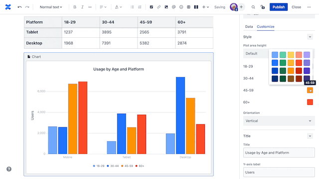
Insert the Chart Macro: Click on the spot where you want your chart to appear, type /chart, and select the chart macro. This nifty tool allows you to create various types of charts directly in your page.
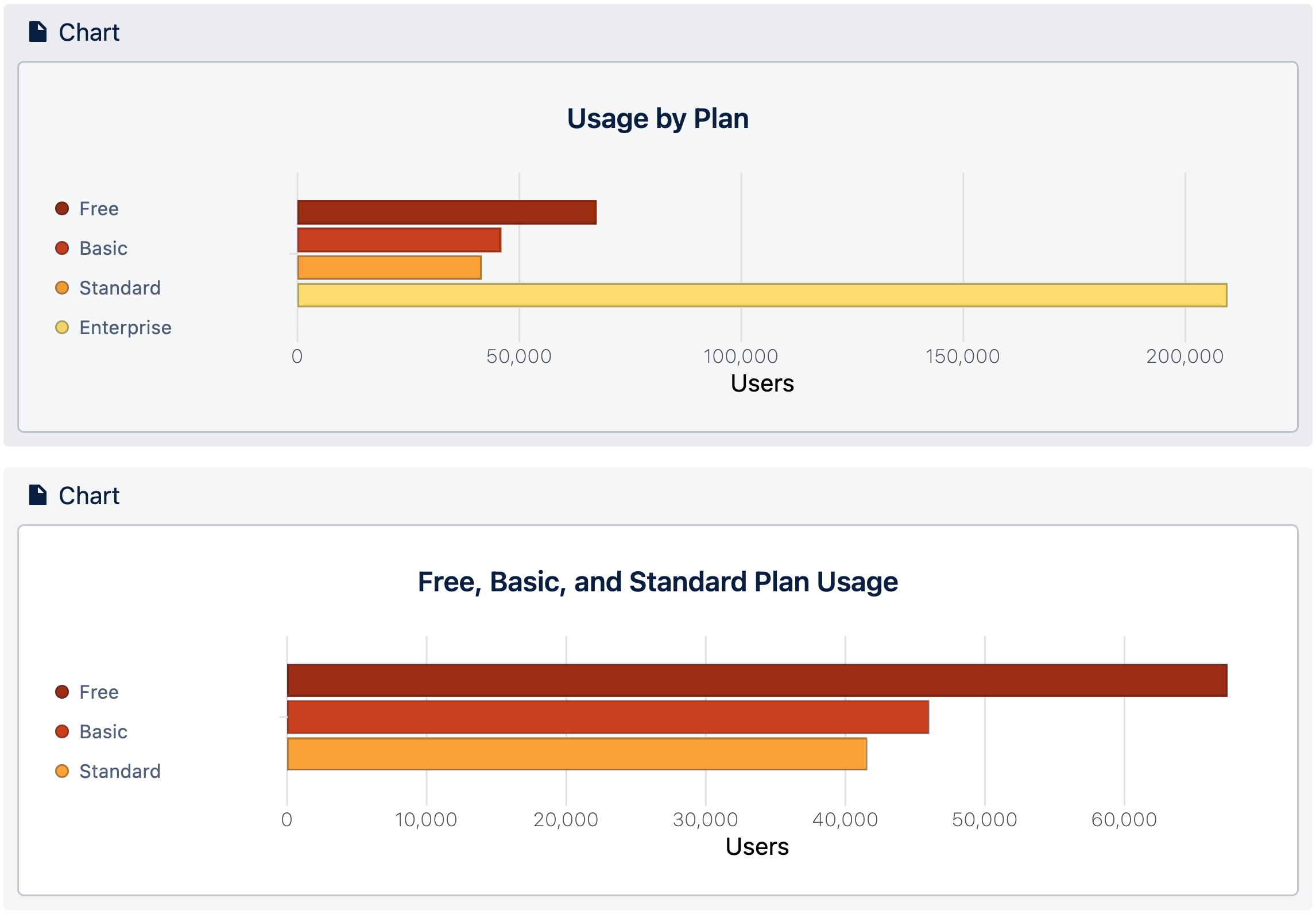
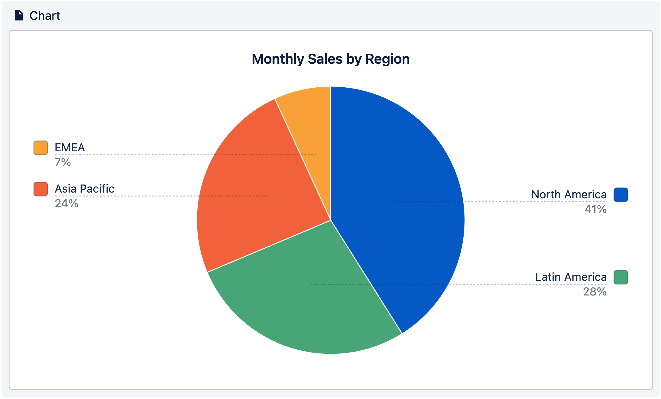
Configure Your Chart: Choose the chart type that best represents your data—be it a bar chart for segmented information, a line chart for trends over time or a pie chart for visualizing parts of a whole. Map your table columns to the appropriate axis and customize the appearance to fit your needs.
Review and Refine: After inserting the chart, take a moment to review it. Ensure it really represents your data and is easy to understand. Make whatever tweaks you think are needed to improve clarity and aesthetics. ✨Ooooo, so pretty and effective!✨
Best Practices for Creating Effective Charts
Here are some tips you can use throughout your uncharted journey:
Choose the Right Chart Type: Select a chart that aligns with the story your data tells. For instance, use bar charts for comparisons and line charts for trends.
Keep It Simple: Avoid cluttering your chart with unnecessary elements. Focus on the data that matters most to your audience.
Use Consistent Formatting: Maintain uniform colors, fonts, and labels across your charts to create a cohesive look.
Provide Context: Include titles, labels, and legends to help viewers understand what they're looking at.
Enhancing Your Charts with Additional Tools
While Confluence's native chart macro is powerful, sometimes you might need a bit more oomph. Third-party apps like Table Filter, Charts & Spreadsheets and Custom Charts offer advanced features such as dynamic filtering, pivot tables, and additional chart types, allowing for more interactive and customizable data presentations.
Charting the Uncharted
Creating beautiful charts in Confluence Cloud doesn't have to be daunting. With the right tools and best practices, you can transform mundane data into compelling visuals that inform and engage your team. So, go ahead and give your data the spotlight it deserves!
Read our full article to get a deep dive on the value of each chart type and color choices, and when you might use them.
Create Product Fact Sheets from Confluence
Did you know you can use Confluence to create compelling product fact sheets and export them into beautifully designed, on-brand PDFs?
Just assemble the facts in Confluence, then use the new product fact sheet template with Scroll PDF Exporter to share it in style. 😎

