#62 – 🆕 The (Mostly) Better Confluence Redesign 🤨
Hey friends, this is your Weekly Dose of Confluence where we summarize the latest and most important Confluence News directly in your inbox. If you were forwarded this message, you can get the free weekly newsletter here.
In this article, we look into the upcoming Confluence Cloud redesign and we’ll share what we love, and what we think might need a bit more love from the Confluence team.
Let's dive in!
As we’ve shared in the past, Atlassian is rolling out a new UI redesign across all their products. The changes affect text sizes, iconography, navigation, and the look of many common visual elements. While change can feel scary, we at K15t generally try to embrace it. As both passionate Confluence users and fans of ever-improving design, we want to believe these changes are the result of thoughtful consideration and care from the Confluence team.
And for the most part, the changes are really stellar. Most are quite subtle, but it’s clear the team has done a lot of work to unify disparate features that have been added to Confluence over time. And while the navigation changes are most likely the hardest-hitting, they’re great—for the most part.
Let’s take a look at some of the changes, share some thoughts on what’s great, and highlight areas that could use improvement.
Consolidated Navigation
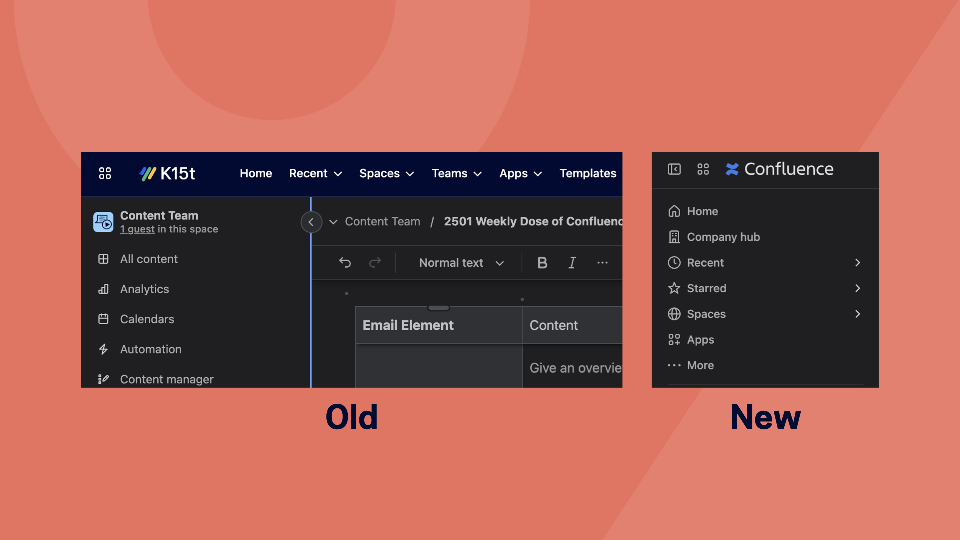
The most noticeable change included in this redesign is the reimagined navigation. In the past, Confluence had navigation options separated from space-level options, with some in the top bar and others in the sidebar. That is no longer the case. With the redesign, all navigation items now live in the sidebar alongside space-level options.
We’ll admit, we were a bit skeptical of this change, especially since this isn’t the first time the Confluence team has tried something like this, but we truly think this is a change for the better. Putting all the important navigation in one place—and in this thoughtful order—really helps users see what they can do throughout Confluence and within the space or content they’re viewing.
Which menu options are shown, and in what order, are all customizable. That said, the default order is already ideal for most users.
Top Bar Focused on What You Want to Do
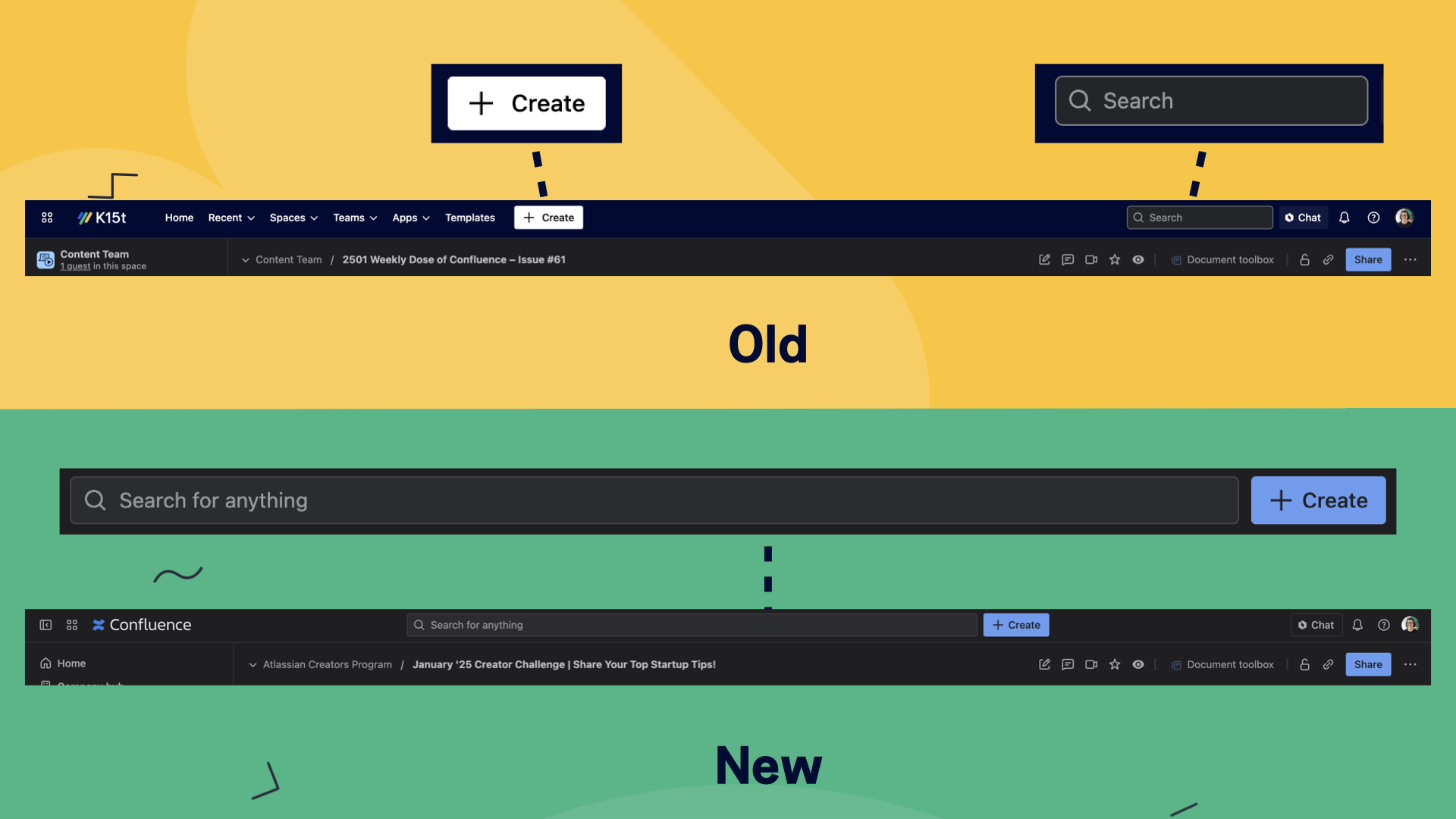
With the top bar freed up from its previous navigation duties, the Confluence team has focused its role on the things we all do most: searching and creating content. A giant search bar is now very prominent, which feels like a welcome change compared to the smaller one in the old design. While the search experience itself hasn’t changed, we feel this still improves the way the interaction feels—especially when using Rovo search. (Can confirm, it’s better 😉)
While the “+ Create” button remains unchanged, it now feels a bit more prominent alongside the search bar, helping to distinguish that it’s not a navigation option but the way to get started on something new.
Pain in the Apps
Does your team use apps in Confluence? You know, those handy additions from the Atlassian Marketplace that enhance Confluence’s capabilities? Well, the way apps are integrated in the new design is pretty lackluster, making us wonder if the designers have ever actually used Confluence apps before.
There is a new “Apps” menu item at the top of the navigation bar, giving access to apps across all of Confluence. While it makes sense to have all apps in one organized spot, it’s disappointing that you can’t move an app to a spot in the main list of navigation items. Apps must stay buried in this collapsible list. This would be fine for apps you don’t use often, but for those you use every day? Woof. So frustrating. 😮💨
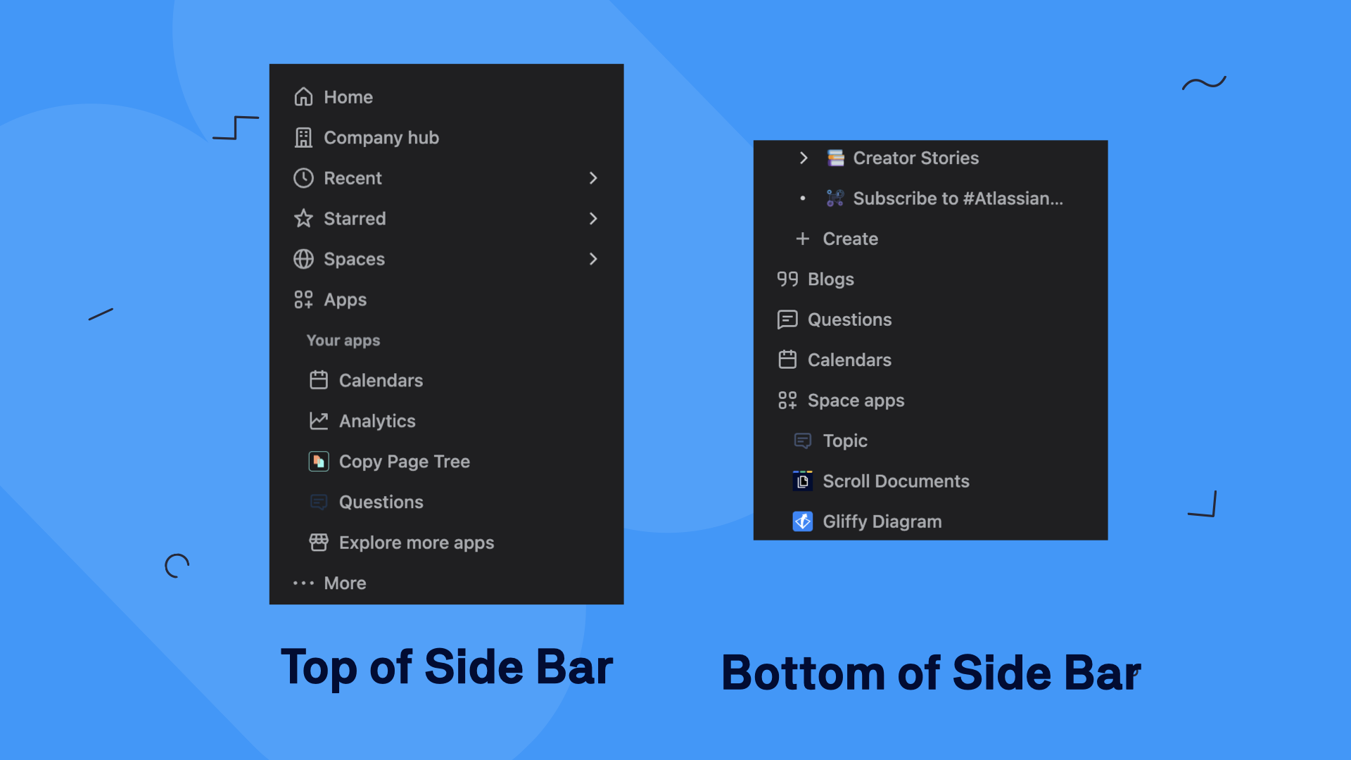
Again, the team has banished space-level apps to the very bottom of the sidebar—below the content tree itself! Sadly, these also can’t be rearranged into a more prominent spot in the side bar. So, if you want to access an app like K15t’s Scroll Viewport, you’ll need to know where it’s hiding and get those scrolling muscles ready—because it’s a long way down.
Of all the changes, this one is perhaps the most frustrating. It feels like waking up one day and finding that your phone has hidden all your favorite apps in two different folders, forcing you to hunt them down in order to do your best work. The context of how we use apps in Confluence is unfortunately completely lost. We’re hoping for more thought and focus in this area in the future.
Simpler Content Tree
A while back, the Confluence team introduced a few different ways to view the content tree of a space. Users could filter content to show recently visited pages, the most recently updated content, or an alphabetical list. While these views were interesting, we’re guessing they weren’t often used—because they’re not making a repeat appearance in the new design.
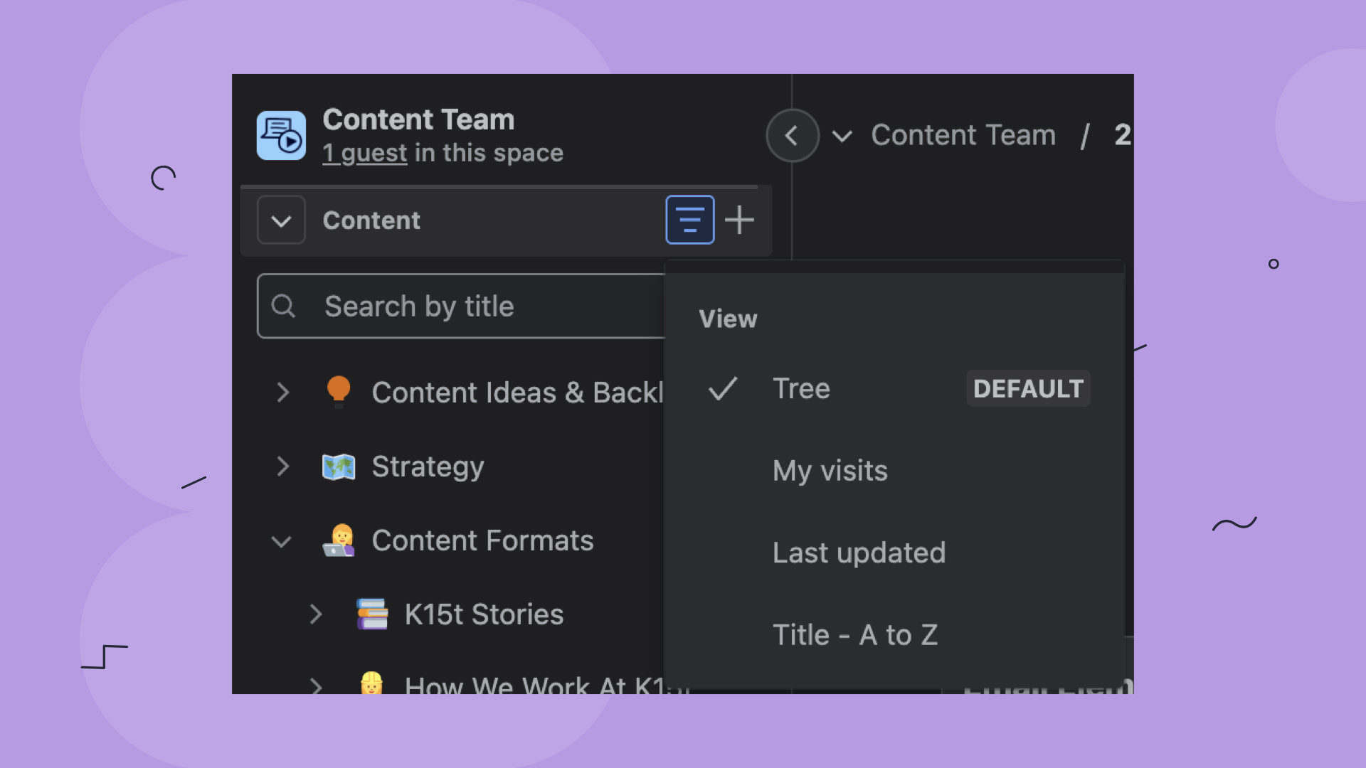
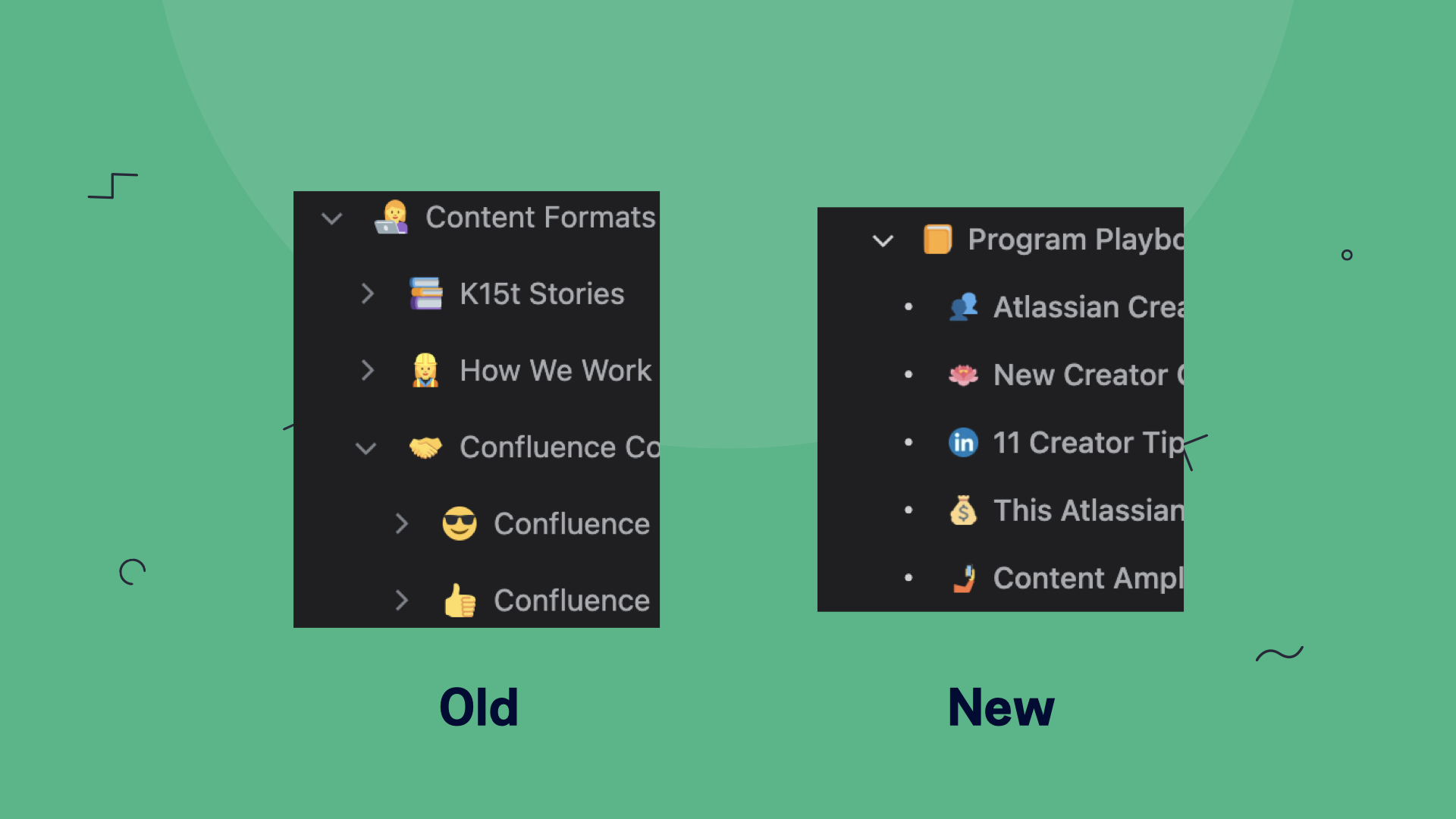
We’re also very happy to see that the content tree now features a slightly bolder typeface and more compact spacing, making it easier to skim for the page you need.
Button, Button, Who’s Got the Button?
In another hit to usability, the redesign has removed many of the page action buttons that used to live in the top right corner when viewing a page. A notable loss is the Confluence automation Manual Trigger menu button (the lightning bolt), which has been moved to the “More actions” menu (the three dots in the upper right or on the page in the content tree).
The change also disallows Confluence apps like K15t’s Scroll Documents from adding page actions here, further disrupting the experience for users who rely on apps daily.
However, there may be hope. In the announcement about hiding the Manual Trigger menu, Avinoam (the product manager for automation) stated that a new contextual side panel with page actions will be added in the future. While it’s hard to visualize how this might work, we’re hopeful that this will restore the functionality we rely on daily.
Change for (Mostly) Better
While we’re not the biggest fans of some parts of the Confluence redesign, we’re overall impressed with how unifying many of the changes are. Between this visual refresh and the already announced addition of Live Edit pages, it really feels like we’re looking at a whole new Confluence—one that mostly aligns with the way our teams do their best work.
Want to imagine with us how these changes compliment live edit pages? Check out our video to learn more.
Export Onboarding Plans From Confluence
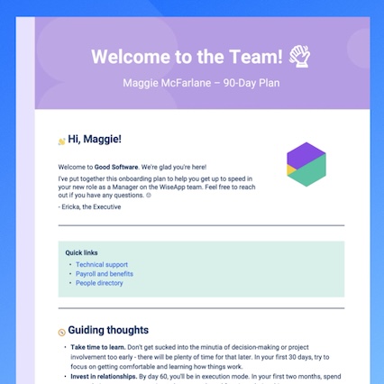
Did you know you can use Confluence to draft onboarding plans for a team member’s first 90 days and export them into beautifully designed, on-brand PDFs?
Just create your onboarding plan in Confluence, then use the new 90-day onboarding plan template with Scroll PDF Exporter to share it in style. 😎

